Sage Green and Cream: How to Get the Ratio Right
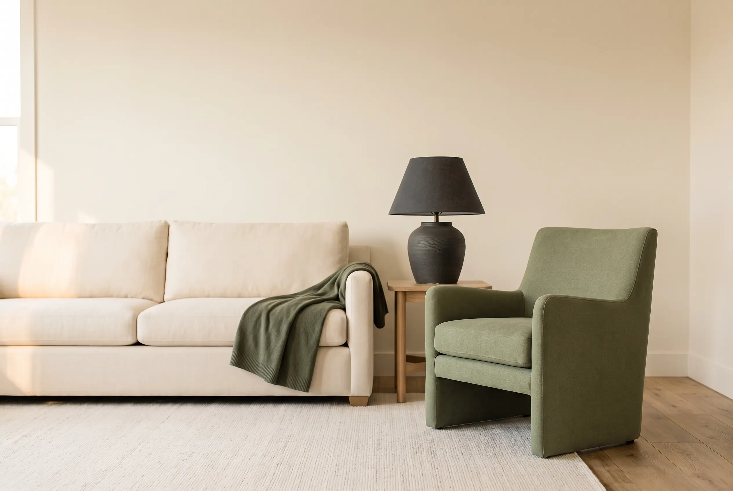
If you’re mixing sage green and cream, aim for 70% cream, 25% sage green, and 5% of a darker accent. That’s walls and large furniture in cream, sage on one anchor piece plus textiles, and the accent on small objects like books, a lamp base, or a vase.
Go heavier on sage in a room under 150 square feet and the space feels smaller, not calmer. This guide breaks the ratio down by surface, room size, and what changes when you’re renting and can’t paint a wall.
The 70/25/5 Ratio, Explained
Cream carries the room. It goes on walls, the sofa or the largest rug, and any built-in you can’t change. That’s roughly 70% of what your eye lands on. Sage green takes the next layer down: one upholstered chair, a set of curtains, or a large piece of art. That’s about 25%. The remaining 5% is your accent, and it should be darker than both, not lighter. Charcoal, deep sage, or even black does this job. Skip the accent and the room reads flat, because cream and sage sit close enough in value that nothing anchors the eye. Think of the ratio in thirds of visual weight, not literal square footage — a small dark object can carry the same 5% weight as a much larger mid-toned one, simply because dark colors pull the eye harder in a room dominated by light, muted tones.
Where the 70% Cream Goes
In a small apartment, put cream on the two largest surfaces first: walls (or a large removable wallpaper panel if you’re renting) and your biggest piece of furniture, usually the sofa or bed. If your walls are already white or a landlord-approved off-white, count that toward your cream percentage instead of adding more. Add a cream or bone-colored rug under the seating area, at least 5 by 7 feet in a living room this size. Bone #F5F1E9 reads warmer than pure white under lamp light, which matters once the sun goes down and your only light source is a floor lamp.
Where the 25% Sage Green Goes
Give sage green exactly one large role, not three small ones. A single accent chair, a set of curtain panels, or a bedspread does more than scattering sage green across five throw pillows. Sage #8A9A7B on one dominant piece reads intentional. Sage green spread thin across a pillow, a candle, and a coaster reads accidental, like you bought whatever was on sale. If you’re choosing between a sage chair and sage curtains for a room under 200 square feet, pick the curtains — they cover more visual area without taking up floor space you don’t have. Floor-to-ceiling curtain panels also make the ceiling read taller, which matters more in a small room than the extra seating a chair would add.
The 5% Accent: What Actually Works
The accent is the color that keeps sage and cream from blurring into each other. Deep sage #5F6E52 or charcoal #2F3229 both work because they’re darker in value than the other two, not because they’re a different hue. Use it on a lamp base, picture frames, a stack of books, or ceramic vases — small objects, not furniture. A single black-framed mirror does more for this ratio than four scattered accent pillows, because it holds one clear edge instead of breaking the wall into small competing shapes. Keep the accent to two or three objects total in a room this size. Add a fourth and it stops reading as an accent and starts reading as a third main color, which throws off the 70/25/5 balance you’re aiming for.
What Not to Do With Sage and Cream
Don’t split the room 50/50 between sage and cream. At that ratio neither color reads as the dominant tone, and the room looks like two half-finished projects instead of one palette. Don’t use more than two shades of green in the same room — a yellow-leaning sage next to a gray-leaning sage fights instead of pairs. And don’t skip the dark accent to “keep it light”: without it, sage and cream sit at nearly the same value on a grayscale, and the room loses depth in photos and in person, especially under overhead lighting instead of a lamp. Overhead lighting flattens both colors more than a lamp does, so if your only light source is a ceiling fixture, lean on the dark accent even harder than these numbers suggest.
Adjusting the Ratio When You Can’t Paint
Most rental leases won’t let you paint sage green on a wall, so shift that 25% into textiles and furniture instead. A slipcover, a large curtain panel, or a bedspread carries the same visual weight as a painted wall in a room this size. Removable wallpaper is the other option — look for a peel-and-stick sage green print rated for rental use, applied to one wall only, not all four. Keep the other three walls in your existing cream or white, since that’s what makes the removal painless when you move out. If you’re hanging a lightweight curtain rod without drilling, use an adhesive rod bracket rated for at least [VERIFICAR: 5 lbs] per bracket — sage green curtain fabric alone weighs more than most renters expect.
Getting the Ratio Right in Fabric
If you’re building the ratio through textiles instead of paint, count every fabric surface in the room, not just the obvious ones. A 6-by-9-foot area rug in cream, two sage green curtain panels, and one sage throw on a cream sofa gets you close to 70/25 without touching a wall. Add two accent pillows in your 5% color — charcoal or deep sage — and stop there. More than two accent pillows in a room this size starts eating into your cream percentage without you noticing. Bedding works the same way: a cream duvet with one sage throw blanket folded at the foot of the bed keeps the ratio intact, while a sage duvet with cream accents flips it and pushes the room toward a heavier, darker feel.
Budget for a Sage and Cream Refresh
A rental-friendly version of this palette runs $150–$400, depending on what you already own. Removable wallpaper runs roughly [VERIFICAR: $30–$50 per roll], and one wall usually needs two to three rolls. A cream area rug in the 5×7 size lands between $80 and $250 depending on material. Sage green curtain panels run $20–$40 per panel at most budget retailers, and you’ll need two per window. Save the accent objects for last — a secondhand lamp or thrifted frame does the same job as a new one for a fraction of the cost. Spend your budget on the 70% layer first, since that’s what sets the tone of the whole room; the 5% accent is where a thrift-store find will never look out of place.
Testing the Ratio Before You Commit
Buy fabric swatches or paint sample cards in both colors before committing to curtains or a rug. Tape a cream swatch and a sage swatch to the wall where the furniture will go, and look at them at three different times of day — morning, midday, and evening under your lamp. Sage green shifts noticeably under warm bulb light versus daylight, and what looks balanced at noon can look too dark by 8 p.m. If you’re testing paint on a rental wall, confirm with your landlord first, and use a peel-and-stick sample instead of a painted one wherever possible. Photograph both swatches together each time you check them; comparing photos side by side later is easier than trusting memory for how the ratio looked the day before.
Frequently Asked Questions
No, as long as the ratio stays uneven. Colors at roughly equal weight look matchy; 70% cream against 25% sage with a small dark accent reads intentional instead.
Yes. Warm wood shares undertones with bone-colored cream, so the two usually pair without a third neutral to bridge them. Lean your sage toward gray rather than yellow to avoid competing with the wood’s warmth.
Count white toward your cream percentage and skip repainting. Add warmth through a bone-colored rug, cream bedding, or linen curtains instead — fabric shifts a room’s undertone more than the wall color alone.
Yes, and it matters more there. In one open room, an uneven split keeps sleeping, seating, and storage areas from blurring together, while a 50/50 split makes the whole studio read as one flat block of color.
